Let's learn, share & inspire each other. Sign up now 🤘🏼
Let's learn, share & inspire each other. Sign up now 🤘🏼
 ARTICLE
 6 min read
The Psychology Principles Every UI/UX Designer Needs to Know

Psychology plays a big part in a user’s experience with an application. By understanding how our designs are perceived, we can make adjustments so that the apps we create are more effective in achieving the goals of the user.
To help you understand the perception of the user, I will introduce some design principles which I think are the most important, and also provide common examples of these principles in practice. Let’s start with the Von Restorff effect:
The Von Restorff effect (also known as the isolation effect) predicts that when multiple similar objects are present, the one that differs from the rest is most likely to be remembered!
Does this ring any bells?
This is the main reason why all call-to-actions (CTAs) look different from the rest of the action buttons on a site or application!

Von Restorff Effect Example
We want users to be able to differentiate between a simple action button and a CTA, in order for them to have a clear understanding what the CTA does, whilst also remembering it throughout their use of the application or site.
“When multiple similar objects are present, the one that differs from the rest is most likely to be remembered!”
The Serial Position Effect is the propensity of a user to best remember the first and last items in a series.
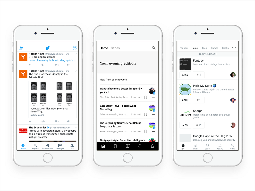
This is why most applications nowadays ditch the hamburger menu and go for a bottom or top bar navigation, placing the most important user actions to the right or left. In the image above, you can see some examples from popular iOS applications. Each put the “Home” and “Profile” items all the way to the left and right, with serial position effect in mind.
Cognitive load refers to the total amount of mental effort being used in a person’s working memory. To put it simply, it is the amount of thought you need to exercise in order to complete a specific task.
“Cognitive load is the amount of thought you need to exercise in order to complete a specific task.”
Cognitive load theory can be differentiated into three types:
I will touch upon the Intrinsic and Germane types as I think that these are the most applicable to UX design.
Intrinsic cognitive load is the difficulty associated with a specific instructional topic. It’s the main reason micro-copy and copy play a huge role in a good user experience.
For example most of the time on applications’ empty states, we prompt users to complete a task. Here, the copy needs to be short, simple and with the appropriate words in order for the user to be able to easily follow the instructions.
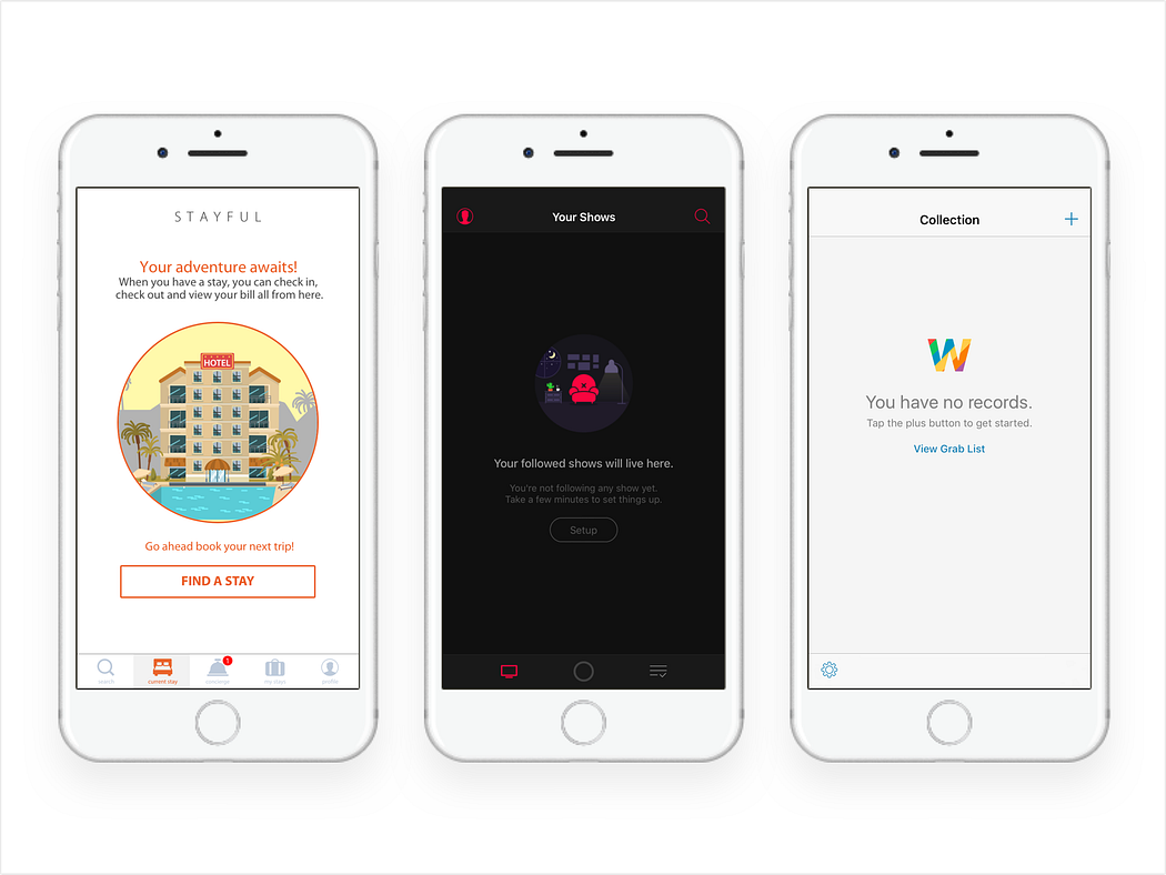
From left to right, Stayful, Serist, Lucidchart
Germane cognitive load is the cognitive load devoted to processing information and construction of schemas. The schemas describe a pattern of thought that organises categories of information and any relationships among them.
One of the reasons we use design patterns is because they’re something we’re programmed to do by default — so it’s easier for the users to recognise and learn something new if they can discern it into a pattern from something they already understand.
“It’s easier for users to learn something new if they can discern it to a pattern from something they understand”
Hick’s Law is the most popular principle, along with the Gestalt Laws.
It’s also very simple to understand and practice. Hick’s Law describes that the time it takes for a person to make a decision depends on the choices available to him or her. So if the number of choices increases, the time to make a decision increases logarithmically.
A very nice example of Hick’s Law that applies to user experience design are lists:
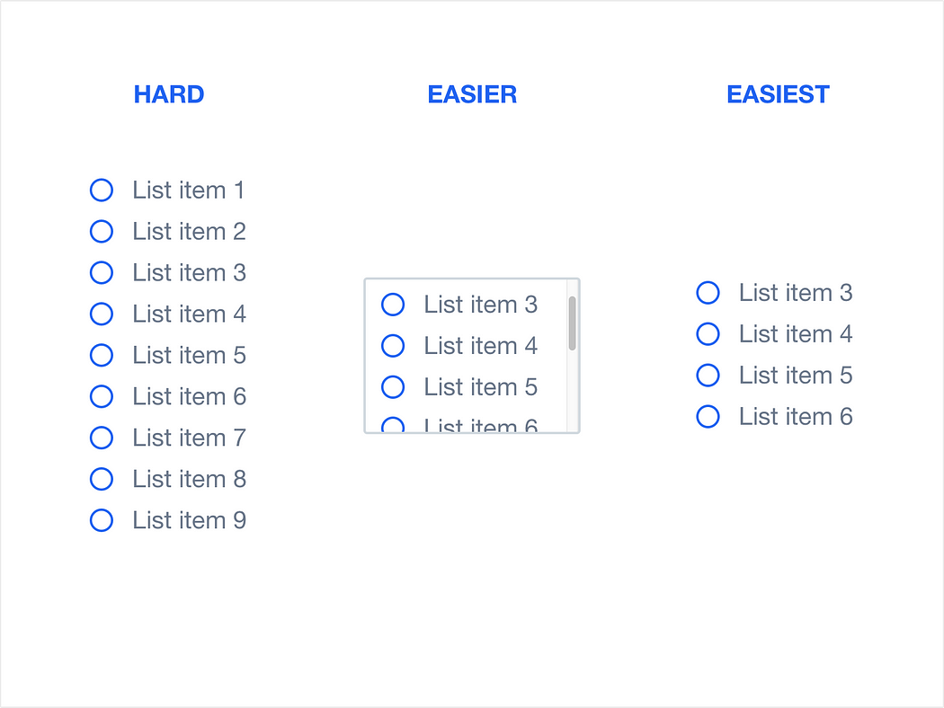
Hick’s Law Example
Law of proximity is part of the Gestalt Laws of Perceptual Organization, and it states that objects that are near, or proximate to each other, tend to be grouped together. To put it in simpler terms, our brain can easily associate objects close to each other, better than it does objects that are spaced far apart. This clustering occurs because humans have a natural tendency to organise and group things together.

Law of Proximity Example
“The Law of Proximity states that objects that are near, or proximate to each other, tend to be grouped together”
In the example above, there are 72 circles. We recognise the circles in groups, based on the distance between them. Categorically, we also perceive that there’s a group of 36 circles on the left side of the image, and 3 groups of 12 circles on the right side of the image.
I believe this example makes it clear that there is a need to group things together when designing a UI, as well as the importance of being careful when putting things together since users may naturally think they are associated with each other.
More like this
EARTHQUAKE ENGINEERING
80 Views, 0 inspired

Management Of Water Resource
31 Views, 0 inspired

Earthquakes In United States
75 Views, 2 inspired

New Model Of Predicting Landslides Caused By Earthquakes
28 Views, 1 inspired
Best GPS applications for 2018: Android
59 Views, 2 inspired
abcedc
76 Views, 1 inspired
CPM - Youtube
67 Views, 1 inspired

What is Construction Project Management?
174 Views, 8 inspired

May 25th: the Death Knell for 24/7 Employee Tracking
109 Views, 3 inspired
Modern Parenting with Modern tools: A State of the Market Overview of GPS tracking of Children
95 Views, 8 inspired
What is Construction Project Management?
169 Views, 1 inspired

Data Privacy in Social Media: Who Takes Responsibility and Data Protection as a Priority Feature
64 Views, 1 inspired
Magnetic Nanoparticles Can Stop Internal Bleeding
62 Views, 2 inspired
How Successful Geolocation Helps Us Achieve a Better Travel Experience
83 Views, 0 inspired
GPS Draining Your Battery: Tips to Stay On Course
57 Views, 3 inspired
Artificial Intelligence Is A Powerful Friend Which Safely Guarded Will Not Become A Dreadful Foe
77 Views, 37 inspired
MSIT presents Paridhi 2018 - annual fest on 23-25 March.
4499 Views, 379 inspired

10 Steps to Start Your Business and Successfully Stay Afloat
107 Views, 193 inspired
Business and financial analysis
99 Views, 207 inspired
What does a Civil Engineer do? And how to become Civil Engineer
245 Views, 95 inspired

Siesmic Competition-Aakaar, IIT Bombay
149 Views, 31 inspired


 Comment


Yash 16 Sep, 2022
What I find remarkable is how this article ignores intent and fulfilment, probably the most relevant of all elements driving the user experience. Intent and fulfilment is the engine of what makes me want to do something. I am looking for an effect, so I am following a certain path to arrive at the effect. It is surprising me how many user interfaces are designed on the surface, with great care for visibility of required actions, but the motives and the user’s mind, their driving intention, are often forgotten.
Sanjam 16 Sep, 2022
I would like to argue that Serial Position Effect is an effect which operates on a different level than presented here. The serial position effect is based on the ability to remember and recall the first and the last object in a series of images/ information in another context e.g a set of projects presented to a prospective client. I believe, in the given example of the menus, the icons are being presented as a single piece of information and the user does not have to recall this information as it is fixed to the bottom of the screen regardless which page she/he is navigating through. The icons have been placed on the edge in an attempt to be more user-friendly as we mainly navigating with our thumbs
Abhishek 16 Sep, 2022
It is easy sometimes to get too caught up in making some original, disruptive design. This is a nice reminder to keep in mind natural tendencies and solid website conventions, Steve Krug mentions this a few times in his book “Don’t make me think”.
prachi 16 Sep, 2022
Great article and I really like how you articulated the principles! The title of the article, however, set different expectations. I was hoping to see more along the lines of emotional design, where design helps improve trust and confidence in your product and persuades the users to do certain things.
Mannat 16 Sep, 2022
Very good article going deep on users (personas) behaviors and emotions might be most relevant part of the research, I believe there is some kind of uniqueness in human, but as well a big scope of patterns and behaviors that we repeat and repeat… these could be an interesting approach: The more we go deep on human psychology we might find a homogenous scope of behaviors and emotions that flourish repetitively
nagaraj 16 Sep, 2022
UI/UX design begins with the people you are designing for and ends with new solutions that are geared toward better fulfilling their needs. This article displays that UI/UX design encompasses building a deep empathy with the people you are designing for through studying psychology. By incorporating the principles of human centered design and learning more about the customers they UI/UX design serves, a more efficient solution will be the result. The most key element of human-centered design is keeping the people you desire to serve at the heart of the process.