Let's learn, share & inspire each other. Sign up now 🤘🏼
Let's learn, share & inspire each other. Sign up now 🤘🏼
 ARTICLE
 13 min read
Differences between Designing Native iOS Apps and Native Android Apps
To create the best native app design, you should bear in mind the differences between the iOS and Android platforms. These platforms differ not only in terms of what native applications look like; they also differ in terms of the structure and flow. You need to keep these differences in mind to provide the best user experience through the native application design.
Native mobile applications for iOS and Android have special operating system-specific features. Guidelines by Apple and Google recommend to use platform-standard navigation controls whenever possible: page controls, tab bars, segmented controls, table views, collection views, and split views. Users are familiar with how these controls typically work on each platform, so if you use the standard controls, your users will intuitively know how to get around your app. We focus on the main differences between interaction design patterns on iOS and Android to clarify why apps look different on iOS and Android — and why they should. We also provide native app design templates and native mobile application examples to help you visualize what we’re talking about.
Moving between screens is a common action in mobile applications. It’s very important to consider that iOS and Android have different native app design guidelines when it comes to navigation patterns. There’s a universal navigation bar at the bottom of Android devices. Using the back button in the navigation bar is an easy way to go back to the previous screen or step, and it works in almost all Android apps.
Global navigation bar (Android)
On the other hand, the Apple design approach is quite different. There’s no global navigation bar, so we can’t move back using a global back button in native iOS app design. This affects the design of iOS mobile applications. Internal screens should have a native navigation bar with a back button in the top left corner.
Back button (iOS)
Apple also includes a left-to-right swiping gesture in applications to go to the previous screen. This gesture works in almost all apps.
Left-to-right swiping gesture — go back (iOS)
The difference between iOS and Android in this case is that on iOS devices in native apps left-to-right swiping gesture will return you to the previous screen. The same gesture on Android devices will switch tabs. But in contradistinction to iOS, there is a bottom navigation bar on Android devices with the back button which will return you to the previous screen.
It’s always important to keep in mind this difference between the platforms to maintain consistency with other mobile applications.
Left-to-right swiping gesture — switch between tabs (Android)
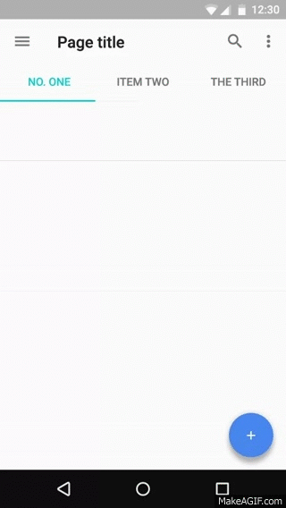
There are a few different navigation options in the Material Design Guidelines. One well-known navigation pattern used in Android applications is a combination of a navigation drawer and tabs.
A navigation drawer is a menu that slides in from the left or right by pressing the hamburger menu icon. Tabs are located right below the screen title and enable content organization at a high level, allowing the user to switch between views, data sets, and functional aspects of an app.
Left — drawer navigation menu; right — tabs (Material Design)
There’s also a component called bottom navigation in Material Design. This component is also important for a Material Design native app. Bottom navigation bars make it easy to explore and switch between top-level views in a single tap. Material Design Guidelines don’t recommended to use bottom navigation and tabs at the same time because it may cause confusion when navigating.
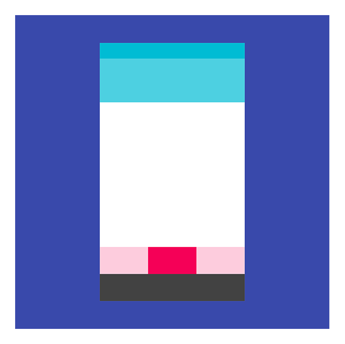
Bottom navigation (Material Design)
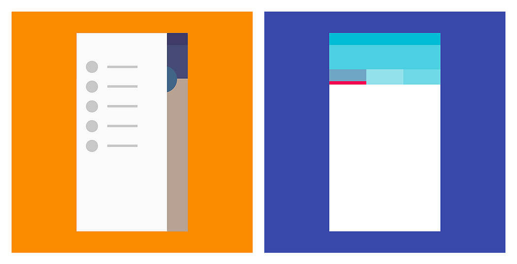
In the Apple Human Interface Guidelines there’s no standard navigation control that’s similar to the drawer navigation menu. Instead, Apple’s guidelines recommended putting global navigation in a tab bar. The tab bar appears at the bottom of the app screen and provides the ability to quickly switch between main sections of an app.
Usually, the tab bar contains no more than five destinations. As we can see, this component is similar to the bottom navigation in Material Design but is more commonly used in iOS apps.
Top left — iOS segmented control; bottom right — iOS tab bar (HIG)
Although there are similar elements that perform similar functions in both operating systems (tabs and segmented control, bottom navigation and the tab bar), navigation is still one of the main differences between iOS and Android. There are both objective differences, such as the global navigation bar in Android and its lack in iOS, as well as differences in the vision of these two systems.
Apple believes that primary navigation elements should be in the foreground and that the hamburger menu should be used only to store functions that aren’t daily tasks performed by the user. On the other hand, it’s common practice to hide primary navigation in the hamburger menu in Android applications.
If you want each element in your application to look the same across platforms, you’ll require additional development efforts to create the best mobile app design. The most complicated use cases involve default controls such as radio buttons, checkboxes, toggles, and so on that require a custom view implementation to show iOS-like controls on Android or Android-like controls on iOS.
Each platform has its unique interactions. Good design is design that respects users’ habits in each operating system. It’s really important to keep in mind the differences between platforms when designing a mobile application for both iOS and Android so you design applications that do meet the expectations of users.
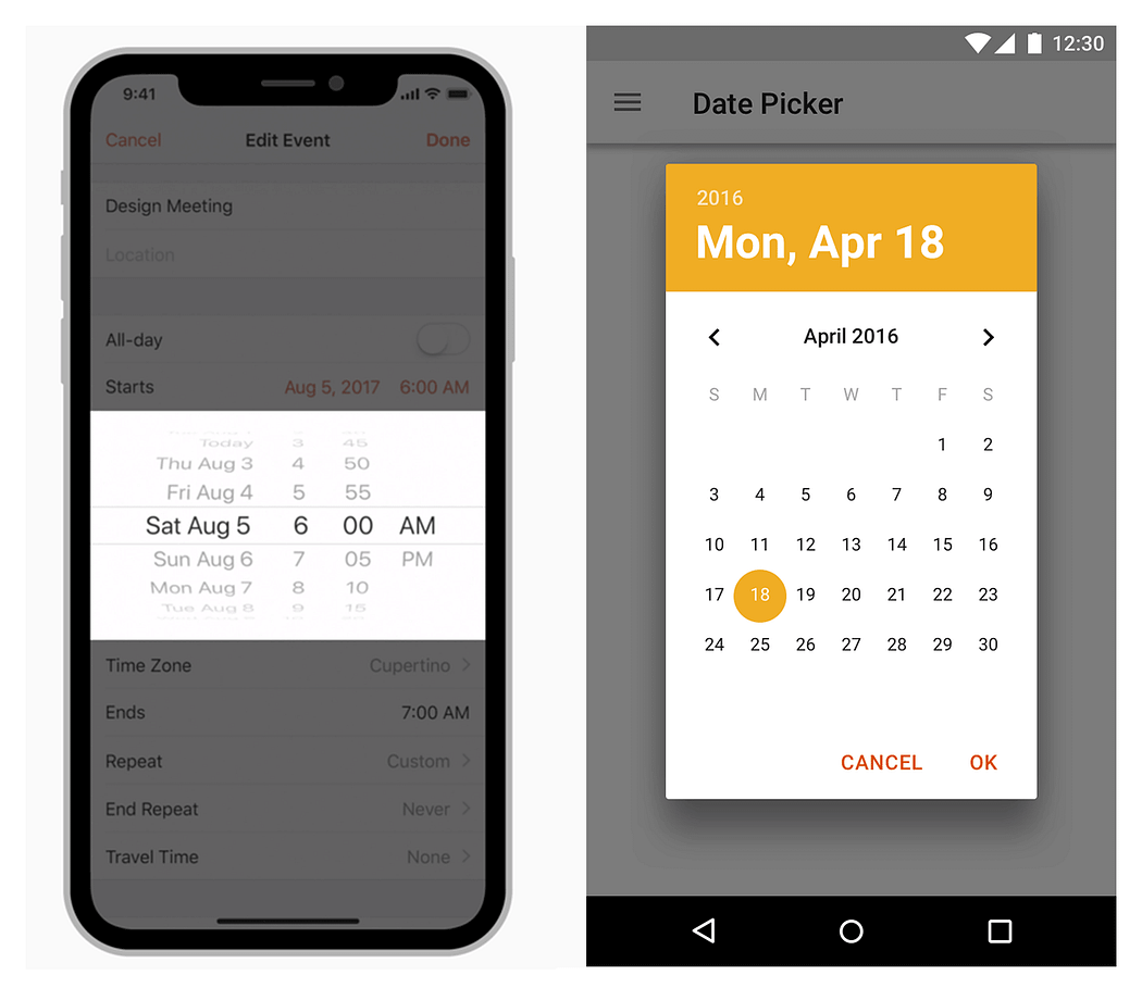
One example of an element that’s typically designed differently on the two platforms is a date picker. Android users aren’t familiar with the slot machine reel-style date selector that’s common in iOS. Using this style of date picker in Android would require custom views, which can get complicated, increasing the complexity and duration of development and making your app design look alien to the Android platform.
Left — standard iOS controls; right — standard Android controls
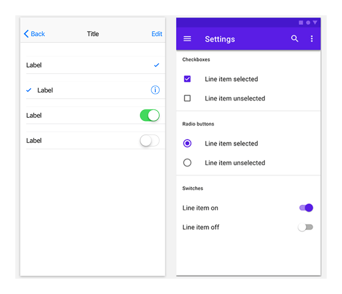
Left — standard iOS pickers; right — standard Android pickers
There are two styles of buttons in the Material Design Guidelines — flat and raised. These buttons are used in different situations. The text on buttons in Material Design is usually all uppercase. Sometimes we find uppercase button text in native iOS apps too, but most often we find title case.
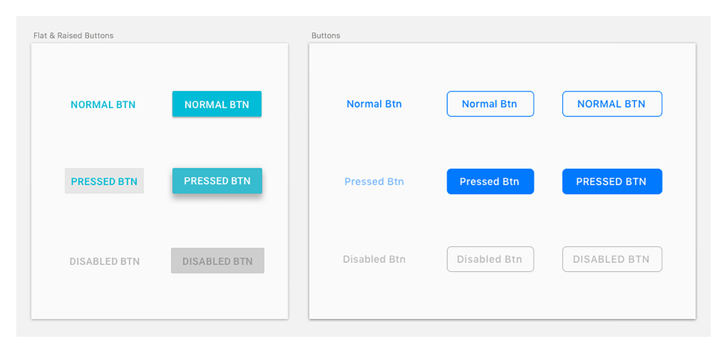
Left — standard Material Design buttons; right — standard HIG buttons
There’s also one more type of button — floating action buttons on Android and call to action buttons on iOS. A floating action button represents the primary action in an application. For example, the compose button in a mail app or the new post button in a social network app can be floating action buttons. The analogous design for the primary action in iOS apps is call to action button, which is located in the center of the tab bar.
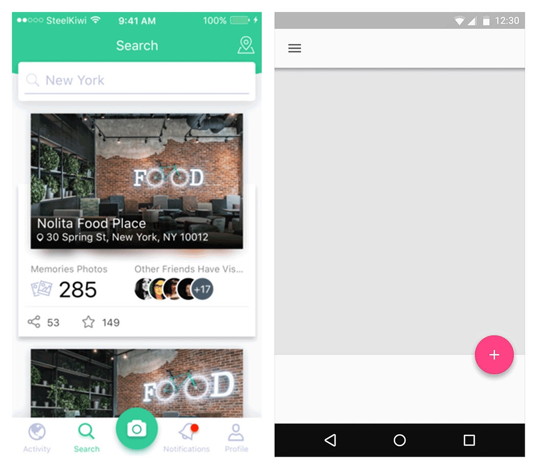
Left — standard floating action button in iOS; right — standard CTA button in Android
There are two types of bottom sheets in Android: modal bottom sheets and persistent bottom sheets. Modal bottom sheets have two types of content: modal bottom sheets with different actions and an app list that appears after the user taps the Share icon. We can find the same types of content in native iOS action sheets and activity views. But these components look different than Android bottom sheets.
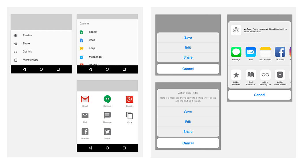
Left — standard Material Design bottom sheets; right — action sheet in iOS app
iOS and Android have slightly different guidelines for touch targets (44px @1x for iOS and 48dp/48px @1x for Android). Material Design Guidelines also suggest aligning all elements to an 8dp square baseline grid.
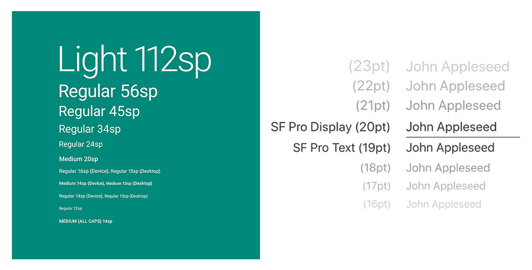
San Francisco is the system typeface in iOS. Roboto is the standard typeface in Android. Noto is the standard typeface for all languages in Chrome and Android that aren’t supported by Roboto. You’ll need to pay close attention to the typographic and layout conventions of each platform.
Left — Material Design typography; right — HIG typography
When it comes to design, the first impression is usually the last for users.
That’s why it’s so important to attract users’ attention from the very beginning. During app design and development, we can create a really fascinating experience for users through microinteractions and animations.
Let’s define the major rules and recommendations regarding interactions and motions for both platforms and look at detailed examples.
Focus and importance — Interactions focus the user’s attention on what’s really important in the app, so it’s necessary to use them only when truly required. Both platforms discourage excessive animations, as they distract and strain users.
Consistency and hierarchy — It’s really important to keep in mind that interactions help users to orient themselves in the app by showing how elements are related to one another. Familiar, smooth, and unobtrusive transitions from one screen to another keep users engaged. Motion indicates how to perform actions and offers helpful suggestions.
Although the basic recommendations for using micro-animations are quite similar in the Material Design Guidelines and the Human Interface Guidelines, there are some differences that are clearly defined. Users are accustomed to these platform-specific transitions and perceive them as being absolutely natural.
That’s why it’s important to pay special attention to familiar interactions that will improve the user experience and look natural on each platform.
iOS users are accustomed to the subtle animations used throughout iOS, such as smooth transitions, fluid changes in device orientation, and physics-based scrolling. iOS users can feel disoriented when movements don’t make sense or appear to defy the laws of physics. If a user reveals a view by sliding it down from the top of the screen, for example, they expect to be able to dismiss the view by sliding it back up. It’s highly recommended by HIG that, unless you’re creating an immersive experience such as a game, you make custom transitions comparable to built-in animations.
According to Material Design Guidelines, during a transition, interface elements that are converted are classified as outgoing, incoming, or permanent. The category to which the item belongs affects how it is converted.
An animation directs the user’s attention. When a UI changes appearance, motion provides continuity between the placement and appearance of elements before and after the transition.
Navigation transitions are an important element in the overall interaction with an interface. They help users orient themselves by expressing the app’s hierarchy. For example, when an element expands to fill the entire screen, the act of expansion expresses that the new screen is a child element. The screen from which it expands is its parent element.
Example of a parent-to-child transition (Material Design Guidelines)
From a parent screen, an embedded child element lifts up when touched and expands in place.
The transition puts the focus on the child screen while reinforcing the relationship between parent and child.
Screens that share the same parent (such as photos in an album, sections in a profile, or steps in a flow) move in unison to reinforce their relationship. The peer screen slides in from one side while its sibling moves off the screen in the opposite direction.
Tabs are at the same elevation and move together on the horizontal
At the top level of an app, destinations are often grouped into major tasks (which may not relate to one another). These screens transition in place by changing values such as opacity and scale.
Of course there are exceptions: some iOS applications follow Material Design Guidelines (like Gmail) and some Android apps follow the Human Interface Guidelines (like Instagram).
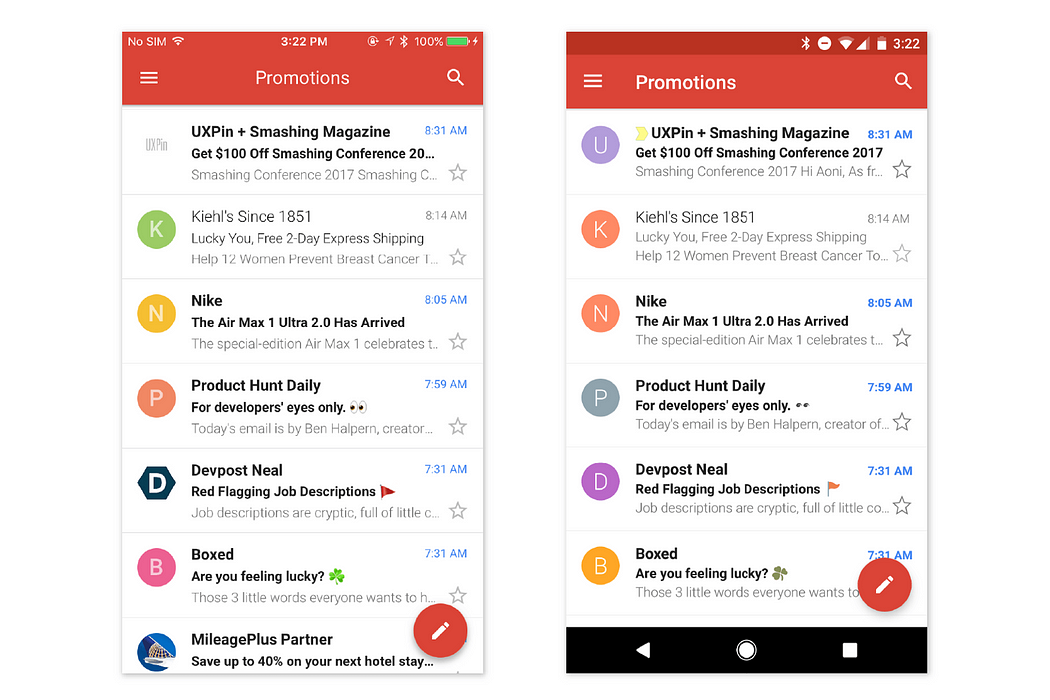
Left — Gmail on iOS; right — Gmail on Android
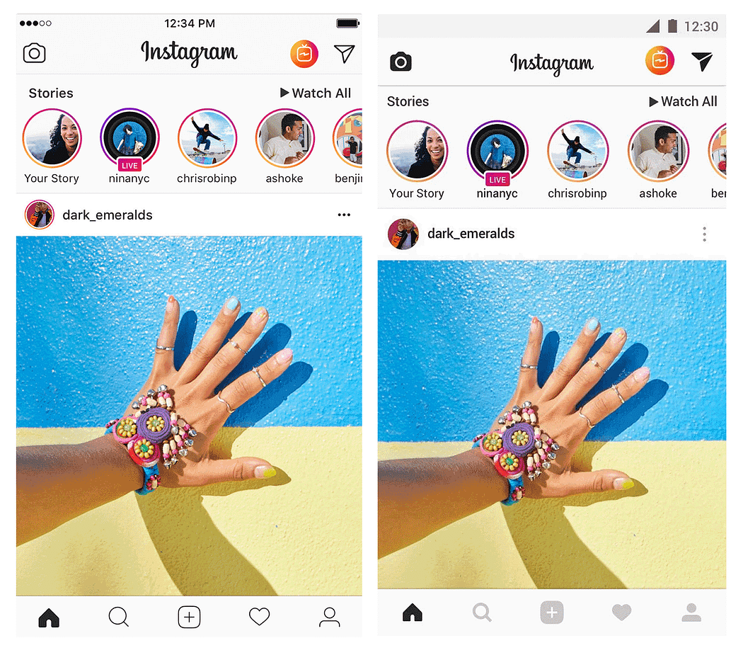
Left — Instagram on iOS; right — Instagram on Android
But one thing is obvious — it’s much faster to design a mobile application using native components for both operating systems. Thus, it’s better to spend time on the design rather than make one application mockup that’s a mix of Apple’s Human Interface Guidelines and Google’s Material Design components and then spend lots of time on development because of custom elements.


 Comment
 Share
Share


Mohit 24 Sep, 2022
Both the apps have their fair share of pros and cons. But the one thing that can be said is native app development is better than hybrid app development. Though hybrid apps are helpful for people who are on a tight budget, they are not preferable if you have a reasonable budget.
jack_1806 24 Sep, 2022
I’m a designer and recently, during an on going project, my android dev team had raised a concern that I’m concentric to HIG, and doesn’t consider material guidelines much while designing native apps. I hadn’t actually thought about it until they highlighted this issue. I mean, what’s the big deal about this right? But, later on, I realized there’s big difference to both platforms, and I was being a jerk throughout to my dev team in realizing it late. Since then, I’m curiously in search of contents that helps differentiate these platforms. And, this article definitely helped clear a major portion of my concerns.