Let's learn, share & inspire each other. Sign up now 🤘🏼
Let's learn, share & inspire each other. Sign up now 🤘🏼
 ARTICLE
 2 min read
Responsive Design Theory
Responsive UI centers on the principles of flexibility and continuity.
Flexibility refers to layouts making optimal use of the available space and adjusting when the available space changes.
Continuity refers to a smooth user experience when switching from one window size to another. Whatever experience the user is currently having should be uninterrupted. Because a change in size may result in the destruction and reconstruction of the entire view hierarchy, it is critical that the user does not lose their place or their data.

Avoid making layout decisions based on physical, hardware variables. It may be tempting to base judgments on set quantities, but in many cases, these figures aren’t relevant for estimating the amount of space your UI can work with. For the same reason, avoid locking your app to a specific orientation or aspect ratio. And also, avoid trying to determine whether the device is a phone or tablet.

Window sizes can differ from the physical device or display size.

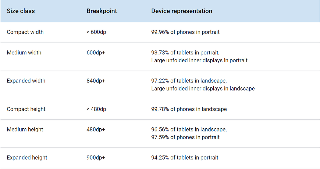
Window size classes categorize the display area available to your app as compact, medium, or expanded. Available width and height are classified separately, so at any point in time, your app has two window size classes — one for width, one for height.
Note: Most apps can build a responsive UI by considering only the width window size class.

Representations of width-based window size classes.

Representations of height-based window size classes.
More like this
What is Across The Globe (ATG) and What do we do?
508 Views, 8 inspired

Playlist Of Every 90's Kid
120 Views, 0 inspired

Music for everyone
49 Views, 2 inspired

Music : The Rhythm Of Life
90 Views, 1 inspired

Emotional Connection to Parents Music
40 Views, 0 inspired

Qawwali - The Sufi Music
74 Views, 0 inspired
Music Effect on Brain!
233 Views, 0 inspired

Sinking Legacy of "Harikatha"
352 Views, 1 inspired

Music - The Enchanting Art Form
44 Views, 1 inspired
Abhijeet, A Musical Rock Star with Honey coated Voice.
142 Views, 0 inspired

Anjum Rehbar
1771 Views, 0 inspired

The Peace In Our Lives Brought By Music
92 Views, 0 inspired

Madhuri Dixit Song, create Mental Health Awareness
213 Views, 6 inspired

Daria Vinichenko is dancing Tabla Solo at the Oryantal Dans Championship of Ukraine
173 Views, 3 inspired

sweet 90's melodious unforgettable singer
85 Views, 2 inspired

Music Or Medicine, Scientific Reports
148 Views, 3 inspired

Ghar Se Nikalte Hi !
87 Views, 6 inspired

Rahat Fateh Ali Khan
238 Views, 8 inspired

Muhammad Atif Aslam
882 Views, 5 inspired

Music in releasing stress
44 Views, 1 inspired
MUSIC
71 Views, 26 inspired


 Comment
 Share
Share


