Let's learn, share & inspire each other. Sign up now 🤘🏼
Let's learn, share & inspire each other. Sign up now 🤘🏼
 ARTICLE
 8 min read
6 things UI/UX designers forget to design
The UI/UX designer is a very important position in a product development team. They are the bridge between customers and programmers, who decodes customer insights, reconcile with business goals and turn it into features, interactions, and interfaces for products. They can take on early-stage work, general strategy, or detailed work such as how the product flow should be, what color buttons should be, etc. In addition to research and design, UI/UX Designer also does data analysis and testing work to optimize the product.
As a UI/UX designer, you are involved in the product development process from the first steps of just a customer requirement file to a complete UI.
The nature of the work makes you focus on handling the core issues of the project. Your UI makes customers happy because the way you solve their business problems is so good. That’s why you sometimes forget about the other sub-components of the UI. Without it, your product will still work fine, but from a user perspective, the lack of these components will make their experience significantly worse.
In becoming a senior UI/UX designer, you should improve these points and give the client and the development team the most complete UI version possible.
Here are the components that many new UI/UX designers forget in the design process.
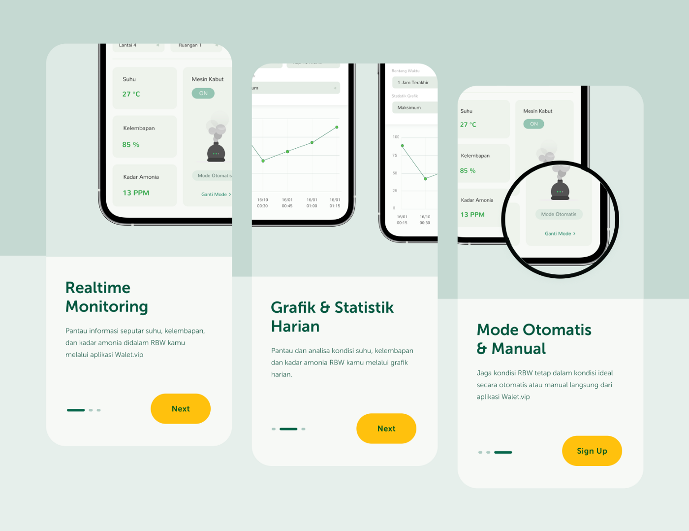
When you first open a downloaded app, the main introductory screens are onboarding screen. The onboarding screen is a guide, intended to provide a brief introduction to the application, its main functions, and how to use it.
The onboarding screen should be designed in a simple style, the content should be filtered, and the main features should be introduced first. Onboarding screens like static state pages are created to inform and educate users. In terms of UX, the onboarding screen saves users from the confusion when starting to use the application and the frustration of having to find the functionality of the application on their own.
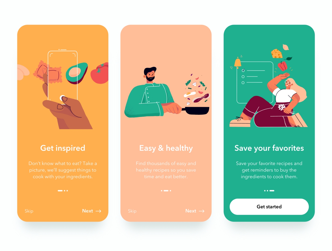
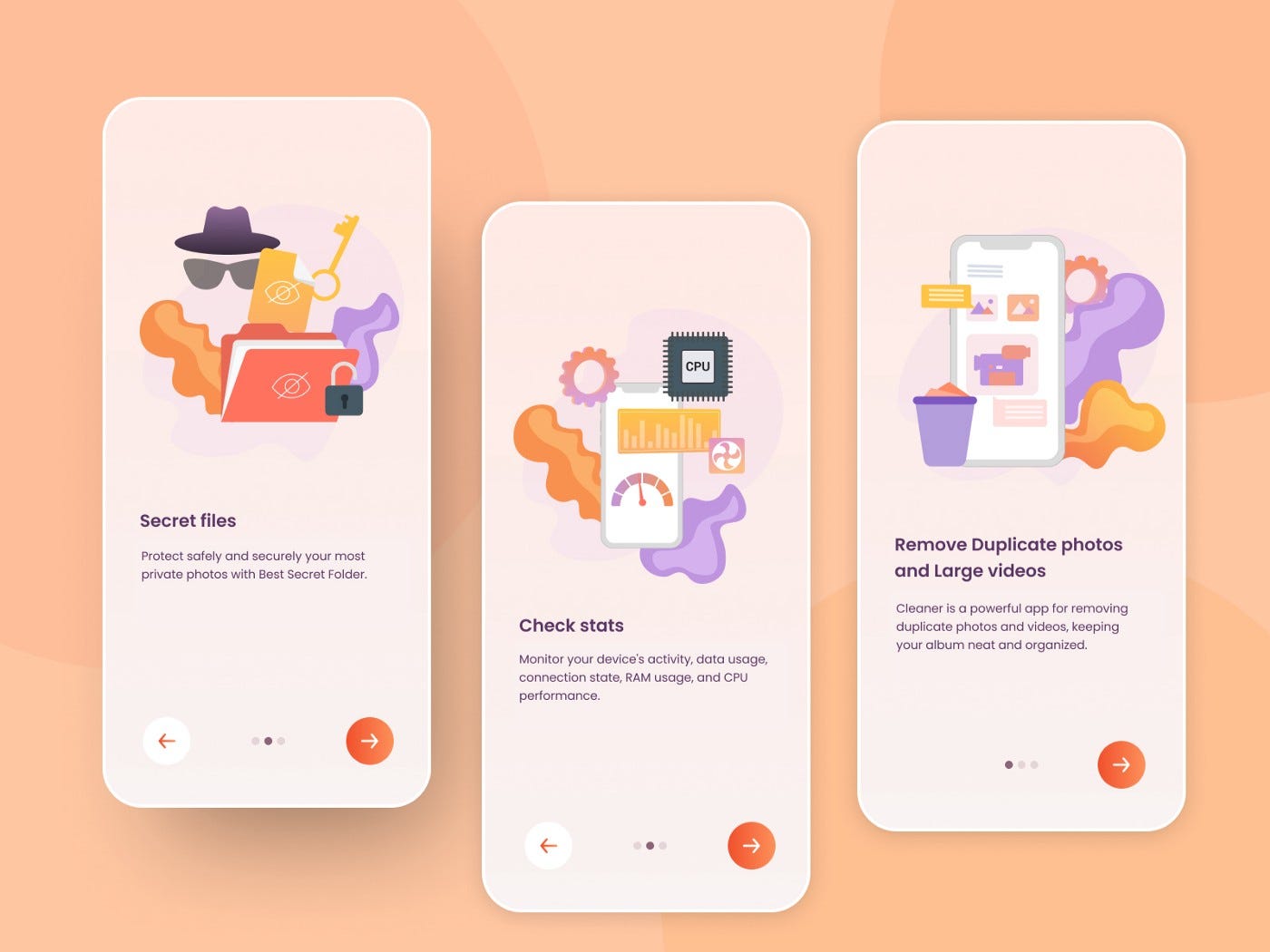
Purpose of using onboarding screen
The user has already installed the app and doesn’t need to read the instruction manual. The user is not yet familiar with the app’s UI or ready to learn about it. Welcome users and excite them about the experience ahead
Help users implicitly or explicitly understand how the app can be used in their lives. Drive users to take actions that increase engagement and retention.
Skeleton is simply a predefined set of frames that replaces the content you want to display while waiting for the data to be loaded. Skeleton helps to increase UX and is especially useful in case your page/app has too much data to load.
The purpose of the skeleton is a preview framework that simplifies loading content in order to reduce user expectations in the time it takes for data to be fully loaded. Elements should have a skeleton such as avatars, cards, charts, lists, tables, text content, images, etc.
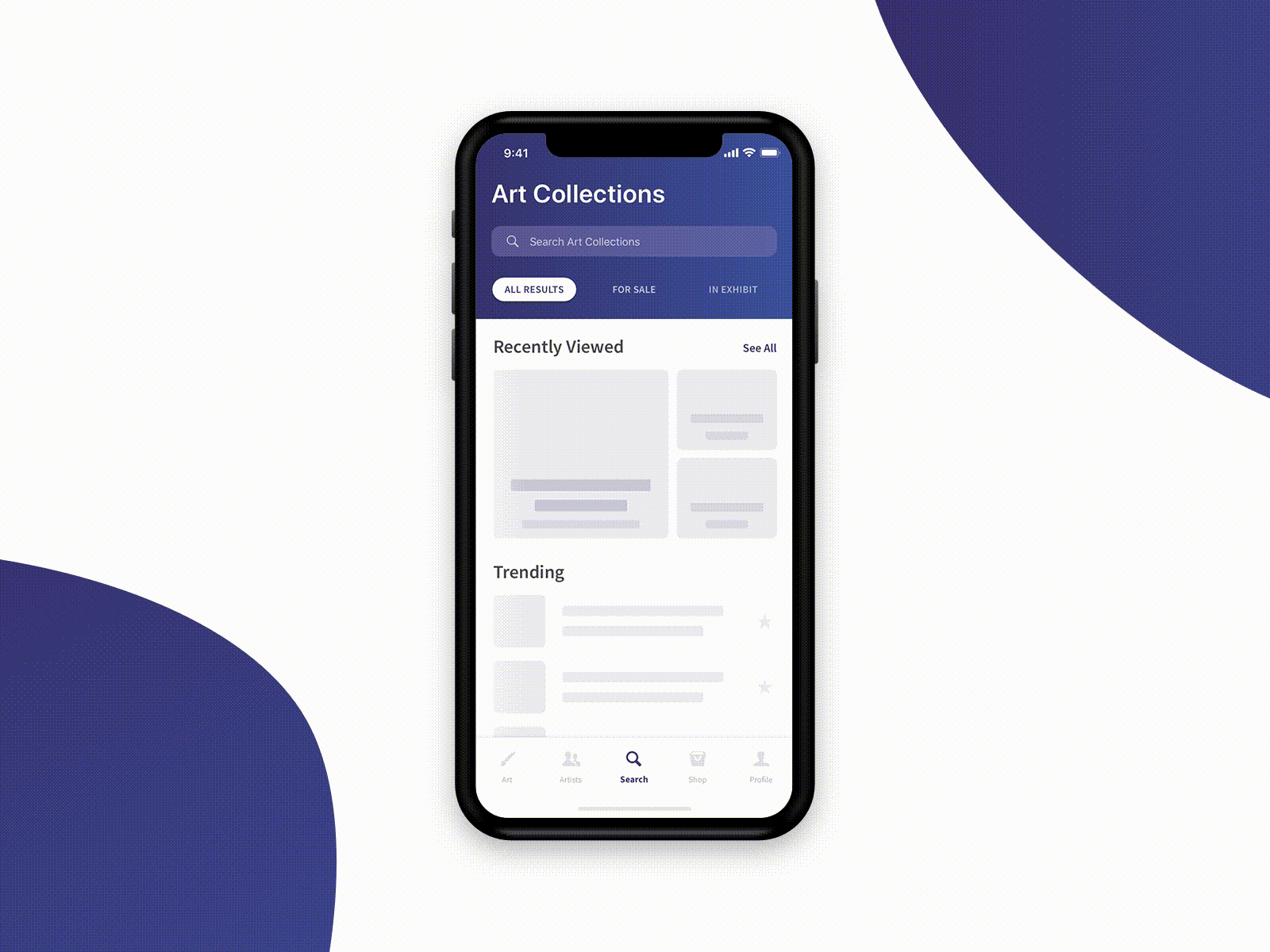
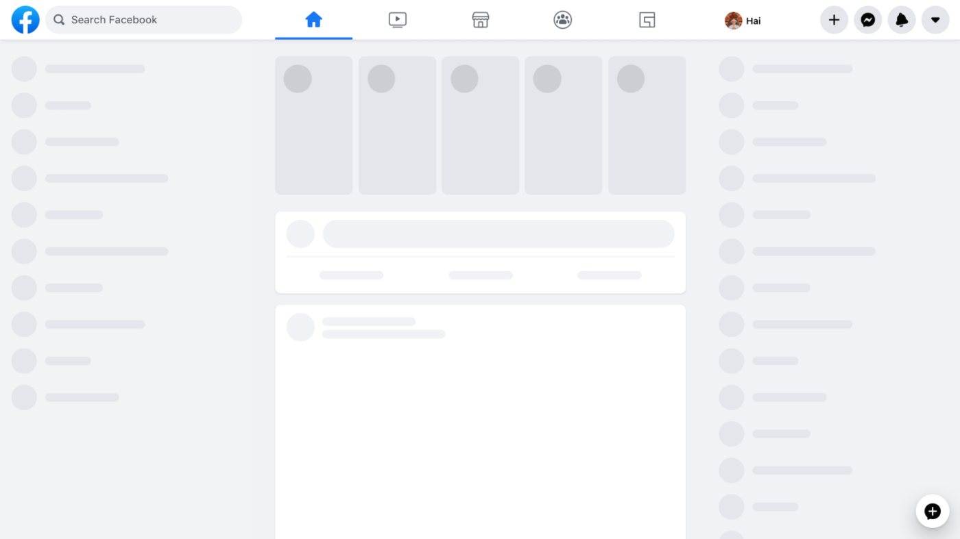
When to use skeleton loader
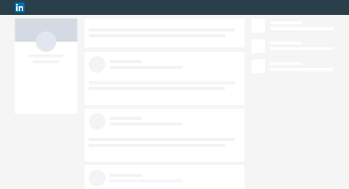
Empty states are the states when the user enters a page but has nothing to display. Then you need an illustration of this page is empty with no data, from which you can suggest action to them. For example, with an empty to-do list page, you could add a “Create To-Do” action.
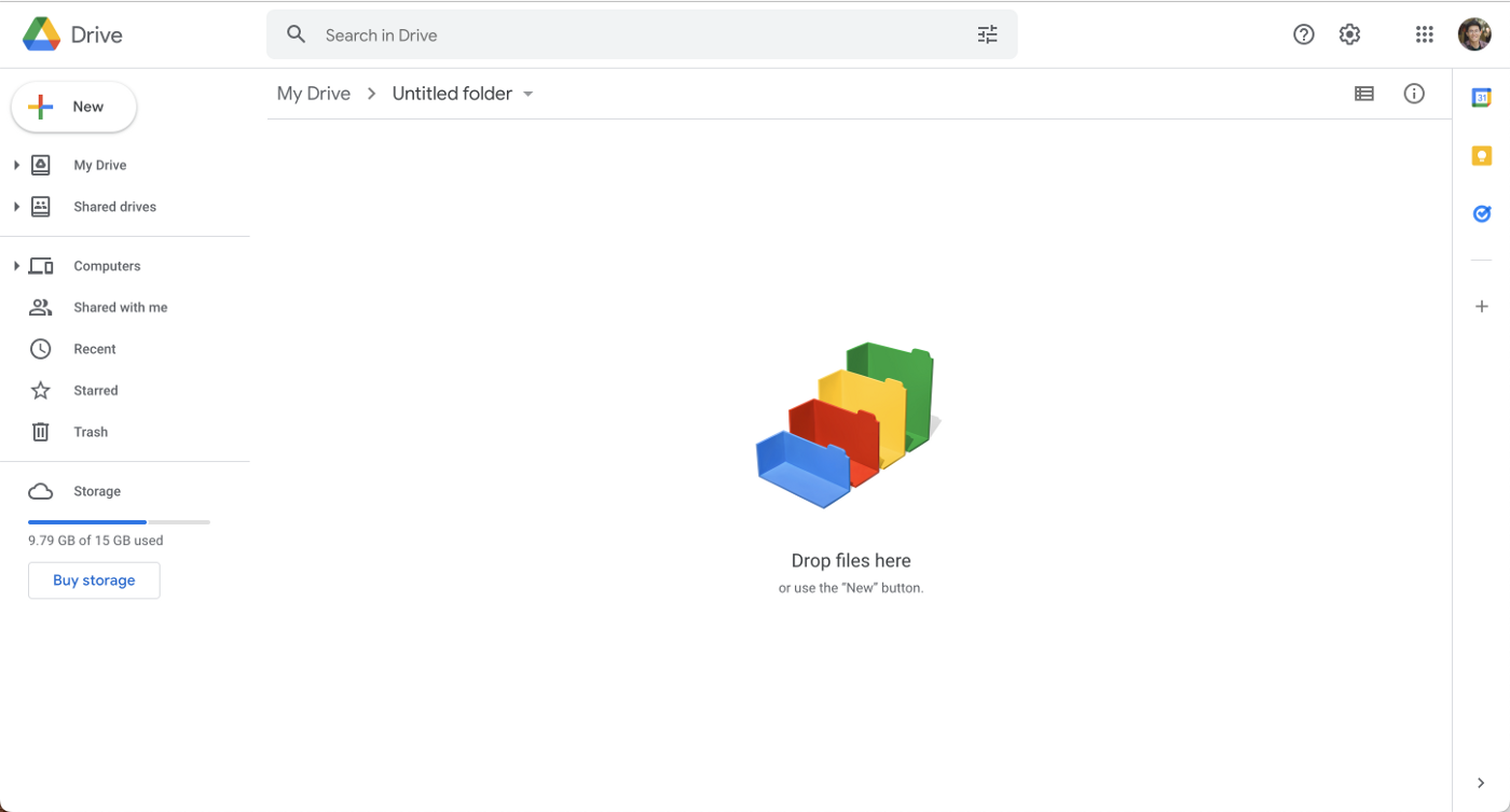
Google drive with a hint
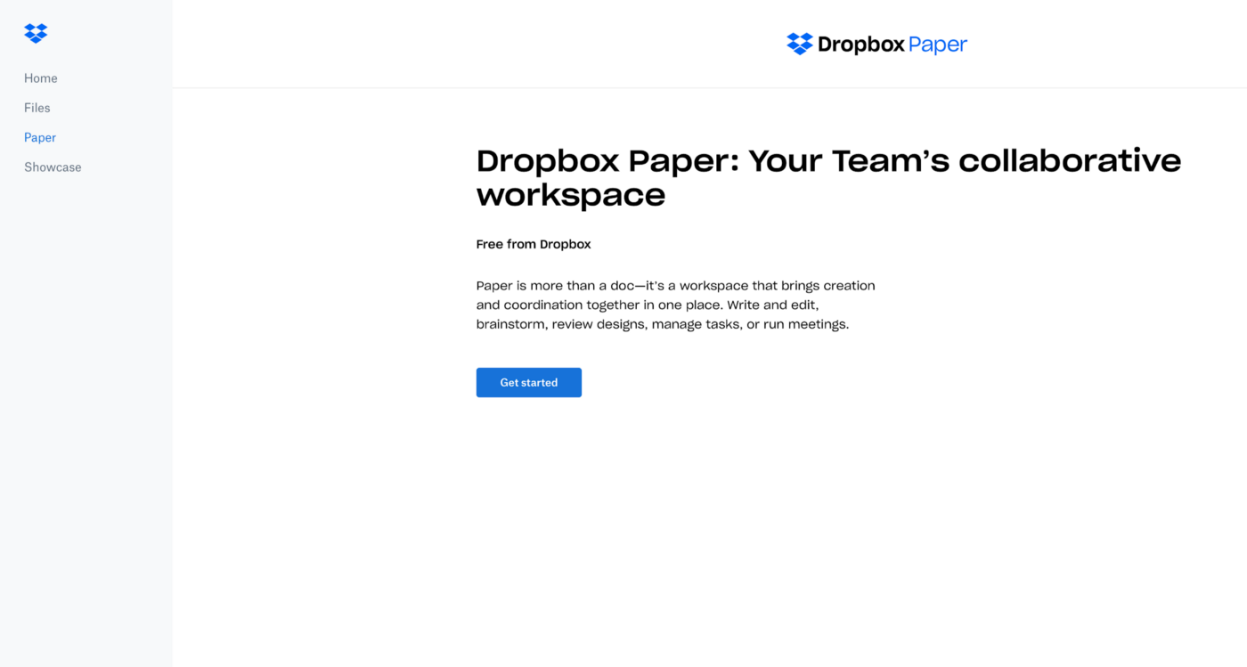
Dropbox — The call-to-action button helps you get going without wondering what to do next.
The splash screen is the intro screen that users see when they launch the app or website. It is a chance to build your brand identity and it keeps users occupied while your app loads in the background. This screen can either be an image, graphic, logo, or animation sometimes coupled with a progress bar. Splash screens were frequently used when devices were slow and the internet was even slower.
The problem with mobile apps is that you can’t afford a long waiting time; the longer the user has to wait, the more likely the user will abandon the app. The splash screen makes the waiting time less painful for the user.
Animation splash screen — Medium app

Static splash screen — Binance, Facebook, NALS quest (NALS internal app)
When a user lands on a page that no longer exists, the URL entered is incorrect, or the link leads to a dead-end, etc., the site will lead you to a 404 page. When they are directed to an error page, it interrupts their flow, which leads to feelings of frustration and they will find their way back. So you should need to design the error pages or else it will cause the user to lose interest in the website at that time. Bounce in these cases is a clear sign that the UX of the product is not good.
A user leaving the site is not only a problem for UX but also bad for SEO (404 pages are one of Google’s SEO ranking factors)
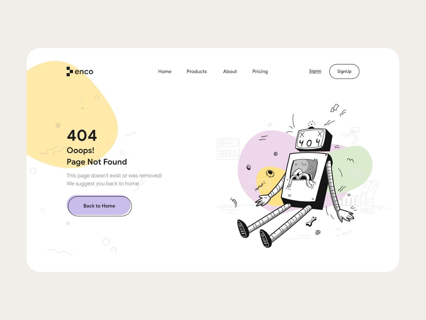
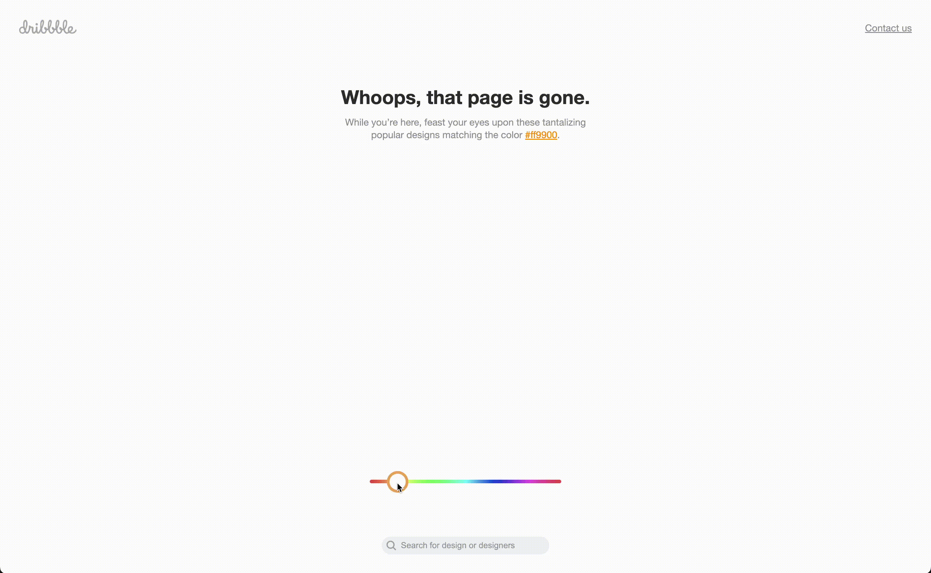
Awesome 404 page by Dribbble
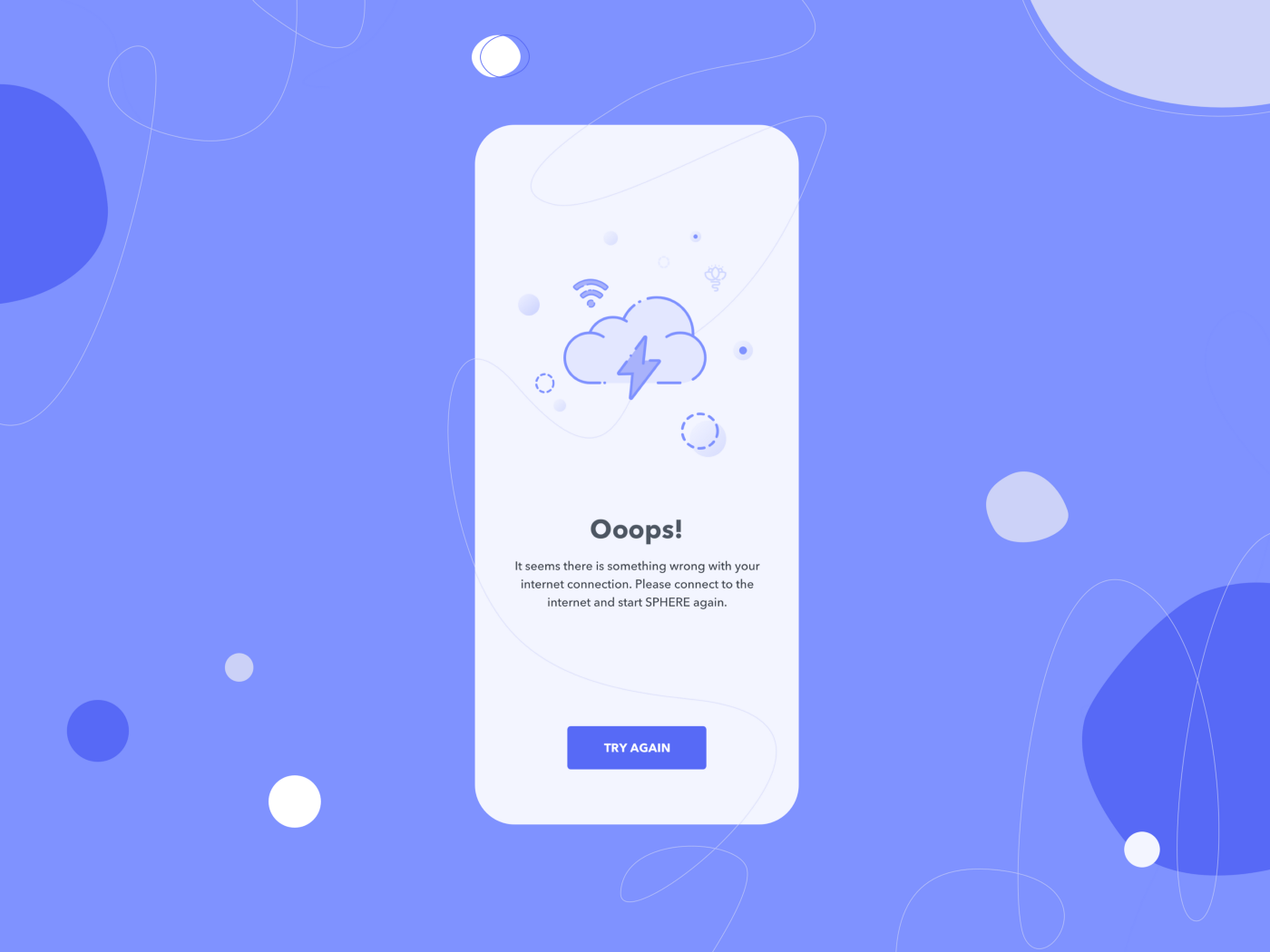
The user’s device isn’t always connected to the internet or sometimes the internet has a slow connection, in case they are on an airplane, suddenly losing wifi connection. Then at times, the UI must display a screen to tell them about the trouble of connection, similar to an empty state, error, this is an issue that disrupts the user experience.
If your application has features that are only available when the user is connected, you should have a notification to the user about the current connection status. You can display the offline pin icon with the text label “You’re offline” in the form of a toast element.

Medium toast message
Designing a digital product is complex, and multi-step, leading designers to sometimes forget about other unimportant screen elements needed to enhance the user experience.
6 things UI/UX designers forget to design
Hope this was useful for you. Thanks for reading through.
Groups


 Comment
 Share
Share


