Let's learn, share & inspire each other. Sign up now 🤘🏼
Let's learn, share & inspire each other. Sign up now 🤘🏼
 ARTICLE
 14 min read
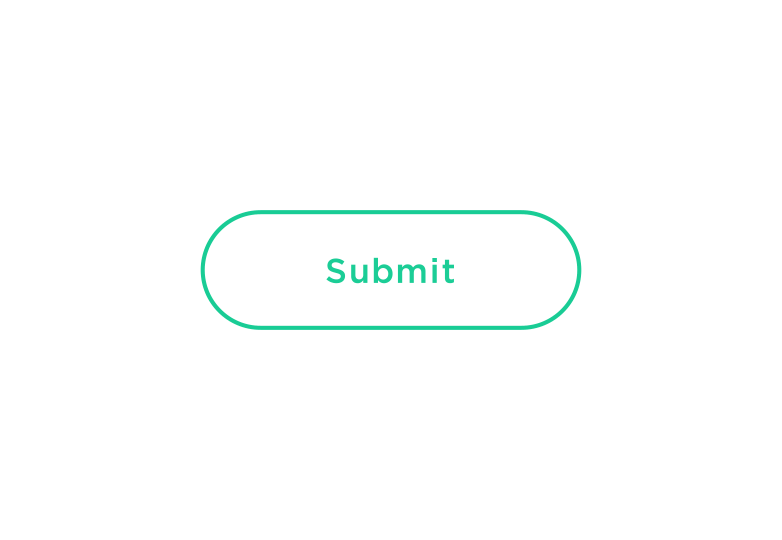
Button UX Design: Best Practices, Types and States
Buttons are an ordinary, every-day element of interaction design. Despite this, because buttons are a vital element in creating a smooth conversational flow in web and apps, it’s worth paying attention to these basic best practices for buttons. Also we’ll go over button types and states — important information you need to know to create effective buttons that improves the user experience.
Best Practices for Buttons
Make Buttons Look Like Buttons
Think about how the design communicates affordance. How do users understand the element as a button? Use shape and color to make the element look like a button.
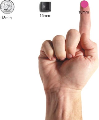
And think carefully about touch target size and padding when designing. The size of buttons also play a key role in helping users to identify these elements. Various platforms provide guidelines on minimum touch targets. Results of an MIT Touch Lab study found that averages for finger pads are between 10–14mm and fingertips are 8–10mm, making 10mm x 10mm a good minimum touch target size.
Location and Order
Put buttons where users can easily find them or expect to see. For example, iOS UI guidelines show known location for buttons
Mind the order and position of buttons. The order that buttons go in, especially if there are corresponding pairs (such as ‘previous’ and ‘next’) is important. Ensure the design puts emphasis on the primary or most important action.
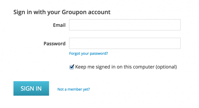
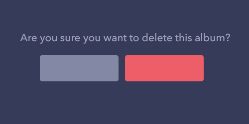
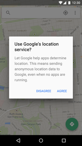
In example below we use red for the button that performs a potentially destructive action. Notice how the primary action is not only stronger in colour and contrast, but also is on the right hand side of the dialog.
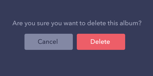
“Delete” button is more prominent than “Cancel” button.
Labels
Label buttons with what they do. Add a clear message of what happens after the click.
Same example as above but without proper text labels. Feel the difference?
No labels for buttons.
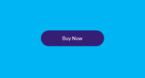
Call to Action (CTA)
Make the most important button (especially if you use them for calls to action) look like it’s the most important one.
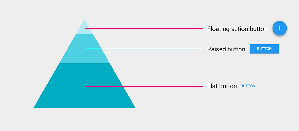
Button Shapes
Usually, you’ll want to make buttons square or square with rounded corners, depending on the style of the site or app. Some research suggests that rounded corners enhance information processing and draw our eyes to the center of the element.
Rounded rectangular button
You can be more creative and use other shapes such as circles, triangles or even custom shapes, but keep in mind the latter might be a bit more risky.
Floating action button is a good example of custom shaped button.
Be sure to maintain consistency throughout your interface controls, so the user will be able to identify and recognize your app user interface elements as buttons.
Button Types and Behavior
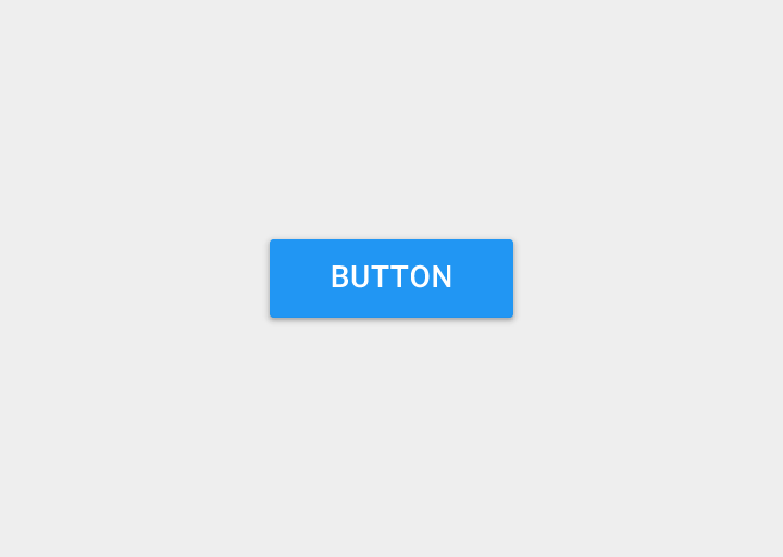
1. Raised Button
Raised Button typically rectangular button that lifts (the shading indicates that it is possible to click). Raised buttons add dimension to mostly flat layouts. They emphasize functions on busy or wide spaces.
Use
Inline (to give more prominence to actions in layouts with a lot of varying content). Use raised buttons to give more prominence to actions in layouts with a lot of varying content.
Behavior
Raised buttons lift and fill with color on press.
Example
Raised buttons stand out more than flat buttons. Example for Android application.
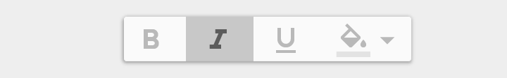
2. Flat Button
Flat buttons do not lift, but fill with color on press. The major benefit of flat buttons is pretty simple — they minimize distraction from content.
Flat button on app canvas.
Use
In dialogs (to unify the button action with the dialog content)
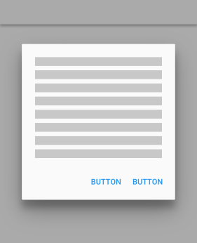
Flat buttons in Android dialog.
On toolbars
Flat buttons on toolbar.
Inline with padding, so the user can easily find them
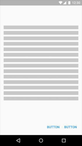
Flat buttons.
Behavior
Example
Flat button in Android application dialog.
Flat buttons in dialog.
3. Toggle Button
A toggle button allows the user to change a setting between two (or more) states.
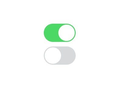
Toggle button.
Use
Most common toggle button is used as On/Off button in preferences.
Also Toggle buttons can be used to group related options. But your layout should be arranged in a way to convey that certain toggle buttons are part of a group. Also toggle button requires:
Toggle button with one option is selected.
Icons are appropriate for toggle buttons that allow a single choice to be selected or deselected, such as adding or removing a star to an item. They are best located in app bars, toolbars, action buttons or toggles.

Toggle button for Twitter “Like” .
Example
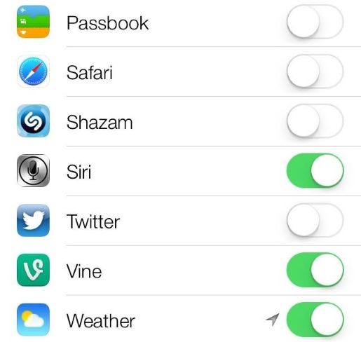
Apple iOS use toggle buttons for Settings section.
4. Ghost Button
Ghost buttons are those transparent and empty buttons that have a basic shape form, such as a rectangular. They are generally bordered by a very thin line, while the internal section consists of plain text.
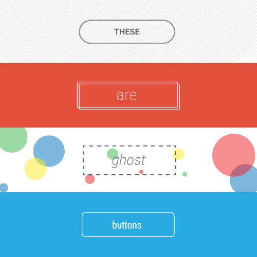
Different ghost buttons.
Use
Using ghost button as a primary CTA is usually not such a good idea. You can see Bootstrap example and ghost button Download Bootstrap which looks the same way as their main logo which may confuse users.
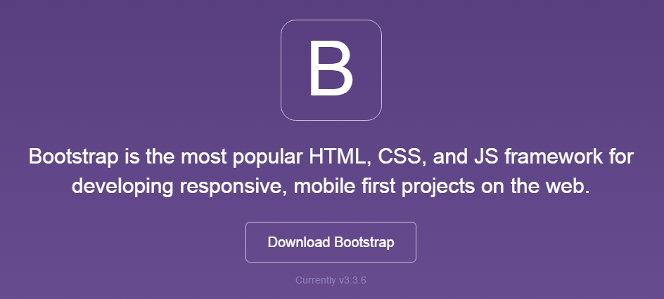
Download Bootstrap is a button.
Ghost button is best used for secondary or tertiary content, since it will not (or should not ) compete with your primary CTA. You ideally want the user to see your main CTA and then (if not relevant) skip over it to the secondary button.
Positive action has much higher contrasts and user sees a clear action.
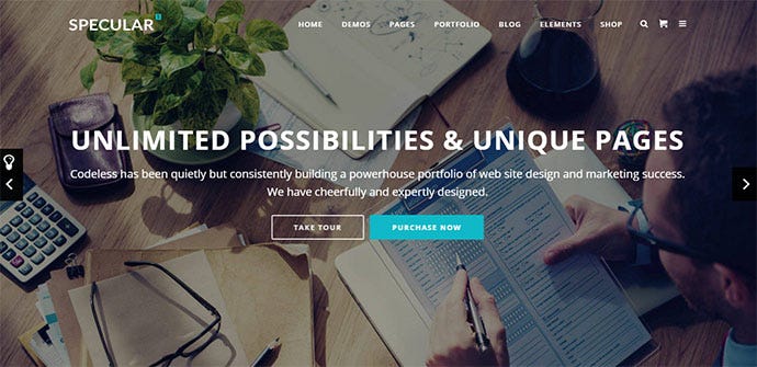
Primary button (CTA) is Purchase Now and ghost button is a secondary button.
Behavior
Normal state (left) and Focused state (Right).
Example
AirBnB website has ghost buttons for action “Become a Host”
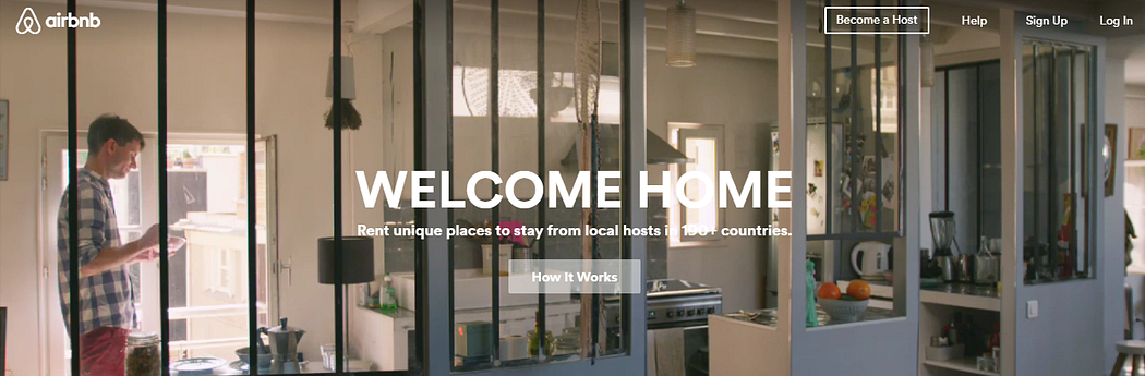
AirBnB website.
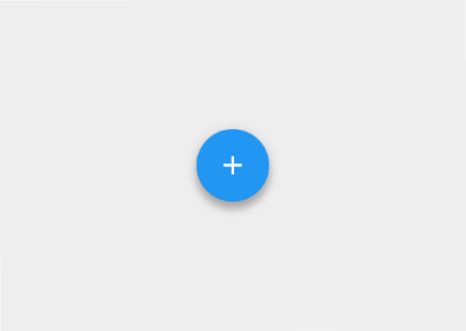
5. Floating Action Button
Floating action button is a part of Google Material Design. It’s a circular material button that lifts and displays an ink reaction on press.
Use
Floating action buttons are used for a promoted action.
Behavior
They are distinguished by a circled icon floating above the UI and have motion behaviors that include morphing, launching, and a transferring anchor point.
Choosing Button Type
Choosing a button style depends on the primacy of the button, the number of containers on screen, and the screen layout.
Button type selection suggested by Google Material Design.
Z-depth.
Function: Is button important and ubiquitous enough to be a floating action button?
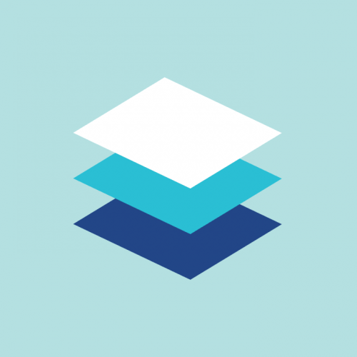
Dimension: Choose button type depending on the container it will be in and how many z-space layers you have on screen.
Layout: Use primarily one type of button per container. Only mix button types when you have a good reason to, such as emphasizing an important function.
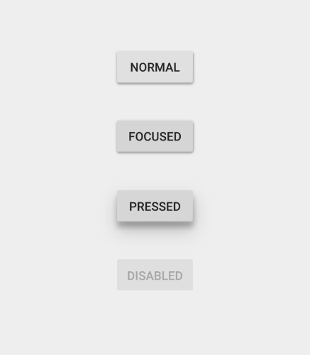
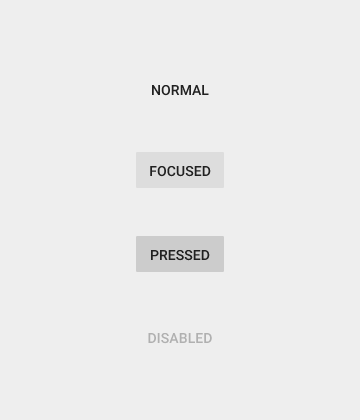
Button States
This point is not so much about how the initial button looks like for the user, but it’s about hovering a button and finding that nothing changes. User might gets confused: “Is it a button, or not. Now I have to click to find out if that thing that looks like a button is actually a button. Well...”
Button isn’t a one-state object. It’s multi-state. And providing a visual feedback to the users to indicate current button state should be a top priority task.
Normal State
Main rule for this state—button should look like a button in a normal state. Windows 8 is a good bad example of such problem — it hard for users to know if things are clickable or not in a Settings menu.
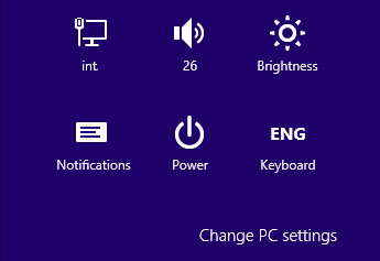
Buttons in Normal state in Windows 8.
Focused State
Offering a good visual feedback to users that they’re hovering over a button is good practice. The user instantly knows their action was accepted and they want be delighted by visual rewards.
Pressed State
By animating different elements of your design you can add a bit of excitement and delight your users with creative and helpful motion.
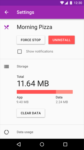
Inactive State
There are two possibility — either hide a button or show it in disabled state.
Arguments for hiding the button:

Gmail hides unused buttons.

And makes it visible only if user made an appropriate action.
Arguments for using a disabled state:
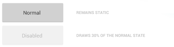
Disabled state button
Conclusion
Button is meant to direct users into taking the action you want them to take. A smooth handover keeps the conversation flowing along; glitches such as an unable to find a right button, at best, as interruptions and, at worst, as breakdowns.
Button UX design is always about recognition and clarity. Think of the web or app as a conversation started by a busy user. The button plays a crucial role in this conversation.
Groups
More like this
Transform Your Distribution Network with Our Cutting-edge Distributor Management System (DMS)!
12 Views, 0 inspired

Why Do Solar Panels Come in Only Two Colors?
14 Views, 1 inspired

Why Your Small Business Needs Sales Force Automation
13 Views, 0 inspired

DELIVERING DELIGHT: HOW A DMS CAN BOOST CUSTOMER SATISFACTION
13 Views, 0 inspired

7 Useful GitHub Repositories to Become a Pro React Developer
136 Views, 12 inspired
The Secret to Mastering ML
88 Views, 25 inspired
Top 7 Tweaks and Tricks to Improve React Performance
57 Views, 16 inspired
Wireframing: 8 Pro Tips for Designers
74 Views, 36 inspired
An A-Z of useful Python tricks
77 Views, 34 inspired
JavaScript concepts that every developer should know
57 Views, 27 inspired
User journey map: 6 things to remember when doing user journey mapping
52 Views, 23 inspired
Design Systems 101: Tips, Tricks, Examples
78 Views, 26 inspired
This is all you need to learn React.js.
53 Views, 14 inspired
Model-View-Presenter: Android guidelines
30 Views, 58 inspired
Deep learning weekly piece: the differences between AI, ML, and DL
37 Views, 39 inspired
There’s never been a better time to learn Android development
40 Views, 53 inspired
Misused mobile UX patterns
49 Views, 52 inspired
Why the net giants are worried about the Web 3.0
54 Views, 19 inspired
Cousins of Artificial Intelligence
120 Views, 90 inspired
The Most Important Rule in UX Design that Everyone Breaks
46 Views, 67 inspired
A detailed guide on developing Android apps using the Clean Architecture pattern
70 Views, 0 inspired


 Comment
 Share
Share


Deekshi 16 Oct, 2022
Great and comprehensive article! Especially since you covered mobile and web. In terms of usability and accessibility, what do you think about Toggles (#3) using only color affordance and direction to indicate state? iOS provides the ability to turn on additional affordances in settings “1/0” to indicate state on toggles, but Material Design/Android does not. Android Material even removed the ability to add text directly to the switch component, so adding On/Off to the control isn’t possible without custom controls. Direction isn’t a reliable affordance since culturally there’s different standards for right/left, up/down indicating an “On” state
lakshita 16 Oct, 2022
This article is amazing. Covers all the button types, from websites to mobile applications. But I have a suggestion, or request to be honest, can you please write more about mobile applications, buttons based on the context. E.g. If there is a list of items on the mobile screen, then what about user experience related to buttons and micro actions? Thanks!